Setup autowrx instance
This guide will walk you through the steps to set up, run, and customize an instance of the open-source autowrx project.
Prerequisites
Before proceeding with the setup, ensure that you have the following prerequisites installed on your system:
- node (version 20.12.12 or higher)
- Yarn (optional, if installed, it needs to be installed globally)
Setting up autowrx
Follow the steps below to set up your instance of autowrx:
-
Clone the Repository
First, clone the autowrx repository from GitLab. You can choose to clone the repository using either HTTPS or SSH.
To clone with HTTPS, use the following command:
git clone https://gitlab.eclipse.org/eclipse/autowrx/autowrx.gitTo clone with SSH, use this command:
git clone git@gitlab.eclipse.org:eclipse/autowrx/autowrx.git -
Install dependencies
Navigate into the directory of the cloned repository and install all necessary dependencies.
Using Yarn:
cd autowrx
yarn
Using npm:
cd autowrx npm i -
Add a .env File
Next, you need to create a .env file in the root directory of the project. This file will contain configuration variables, such as the server endpoint. Below is an example of what your .env file should look like:
VITE_SERVER_BASE_URL=https://autowrx-server.example.comReplace
https://autowrx-server.example.comwith the actual server endpoint of your autowrx instance. -
Run project
Finally, you can run the project using either Yarn or npm. Choose one of the following commands:
Using Yarn:
yarn devUsing npm:
npm run dev
Your autowrx instance should now be up and running at localhost:3000, ready for you to customize and use.
Customize your instance
After setting up your instance, you can customize its appearance and content. The files and configurations you need to edit for customization are listed and described below.
Editable files for customization
The image below contains the files you can edit:
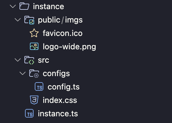
The following files, starting from the root of your project directory, can be customized:
- public/imgs/favicon.ico: This file is the small favicon that appears on the browser tab.
- public/imgs/logo-wide.png: This file is the logo of your instance.
- src/configs/config.ts: This file contains various configuration settings.
- src/index.css: This file contains the styling for your instance.
- instance.ts: This file allows you to update some content of the instance.
Note: If any of the above files do not exist in your project, please create a new file with the exact name.
For more detailed information about the config.ts, index.css, and instance.ts files, refer to the instructions below.
src/configs/config.ts
Refer to the table below for the meaning of properties.
| Name | Description |
|---|---|
| serverBaseUrl | Base URL of API |
| serverVersion | Version of API |
| instanceLogo | Logo of your instance |
| genAI | Related configurations for GenAI feature |
| genAI.defaultEndpointUrl | Default endpoint for calling GenAI |
| genAI.marketplaceUrl | The endpoint for listing GenAIs. Default is https://store-be.digitalauto.tech/marketplace/genai |
| genAI.sdvApp | Array of objects. Each object contains custom GenAI beside listed GenAIs from genAI.marketplaceUrl |
| genAI.sdvApp.id | Id of the GenAI app |
| genAI.sdvApp.type | Type of GenAI. Either GenAI_Widget, GenAI_Python or GenAI_Dashboard |
| genAI.sdvApp.description | Description of GenAI app |
| genAI.sdvApp.endpointUrl | Endpoint URL for calling GenAI. If left blank, it will use genAI.defaultEndpointUrl as a fallback |
| genAI.sdvApp.customPayload | Customize the payload (body) when calling the GenAI |
src/index.css
Scroll down to the bottom of the file (at Font and Colors for instances section). Here are all the properties you can edit to update appearance of the instance globally.
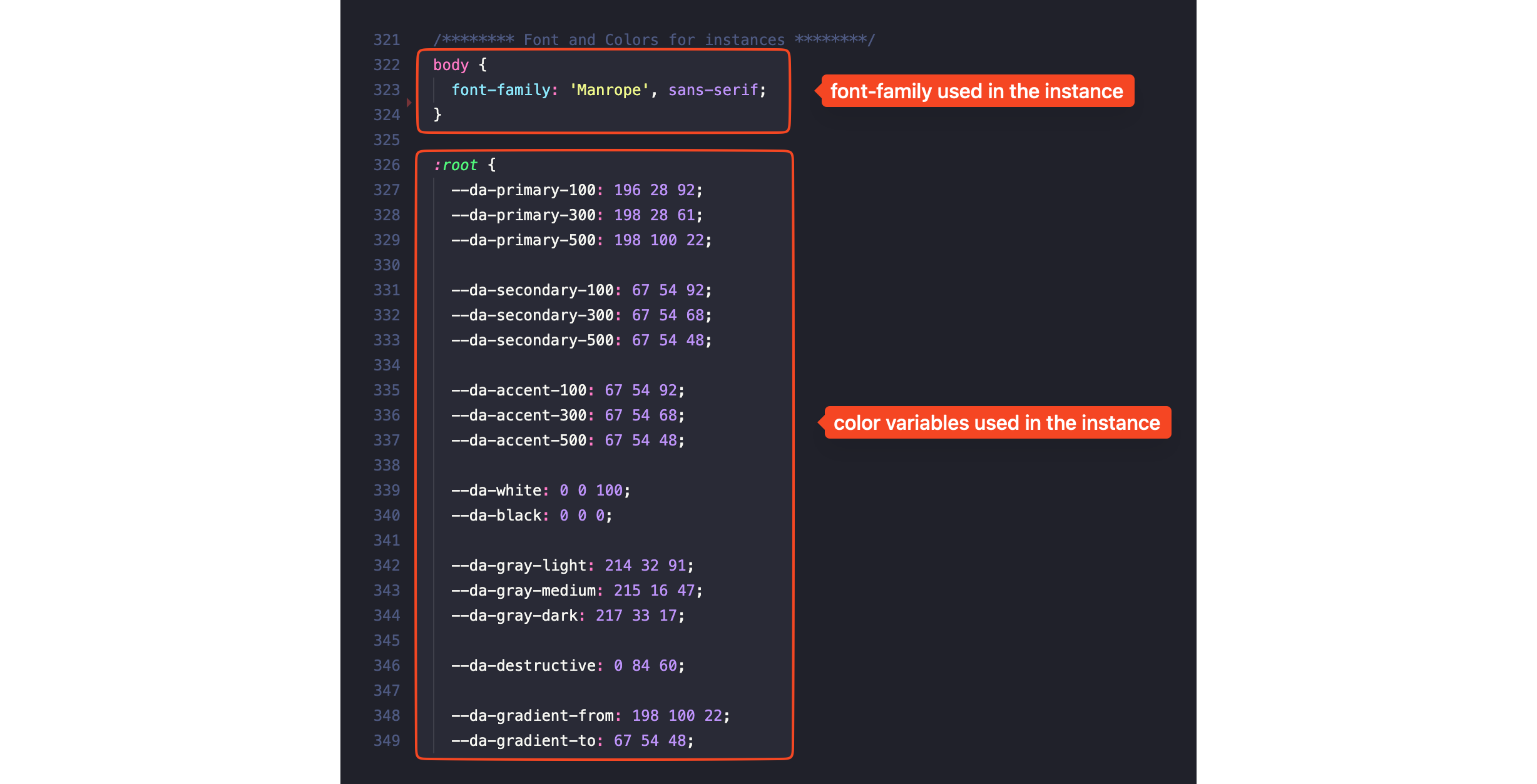
Note: All the color values in the image above are in HSL format. You can update the value with different formats (eg. RGBA, HEX).
Refer to the table below for the meaning of variables:
| Variable | Description |
|---|---|
| –da-primary-100 | Primarily used as the background color for various elements. |
| –da-primary-300 | A median color between –da-primary-100 and –da-primary-500. |
| –da-primary-500 | Mainly used in primary text and certain borders. |
| –da-secondary-100 | Light secondary color. |
| –da-secondary-300 | Medium secondary color. |
| –da-secondary-500 | Secondary color, often used for less important text. |
| –da-accent-100 | Light accent color. |
| –da-accent-300 | Medium accent color. |
| –da-accent-500 | Accent color, used in various text elements. |
| –da-white | The white color, mainly used for text and background elements. |
| –da-black | The black color, used for some text and background elements. |
| –da-gray-light | Light gray color, primarily used for text, background, and borders. titlece. |
| –da-gradient-from | The starting color of a gradient, used for primary buttons and background image overlay on the homepage. |
| –da-gradient-to | The ending color of a gradient, used for primary buttons and background image overlay on the homepage. |
instance.ts
Refer to the table below for the meaning of properties.
| Name | Description |
|---|---|
| name | Name of the instance |
| policy_url | URL to your policy |
| partners | List of your partners. This will be displayed at the bottom of homepage |
| partners.category | Name of the group (category) of partners |
| partners.items | List of partners in a group |
| partners.items.name | Name of the partner |
| partners.items.img | Logo of the partner |
| partners.items.url | URL to partner’s website |
| text | Some text content in your instance |
| text.home_ads_pan_title | The title of the hero banner on the homepage |
| text.home_ads_pan_desc | The description of the hero banner on the homepage |